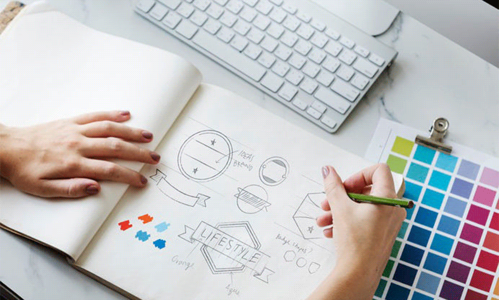
If you do a web search of logos, you might be surprised at how many logos you recognize. There are probably hundreds of national and local brands you can identify simply from their logos. It may not seem all that important if you are a small business owner, but your logo is at the heart of defining your brand. With endless possibilities, creating a great logo can seem overwhelmingly challenging. Before you discuss it with a designer and draw a blank when they ask you for details, here are some important considerations when drafting the image that represents your brand.
It may be a consumer’s first impression of your business
Your logo is more than just an image. It is a symbol that defines who you are and often is the first impression someone gets of your business. The style of your logo should be made of complimentary colors, fonts and images you associate with your brand. It should also be something that makes sense. You may love tropical beaches but live in Alaska. Having a beach themed logo may not be the best option and make sense for your business.
Look at each element individually. What do you think of when you see certain colors, images and fonts? An appropriate font for the logo of a kid-friendly restaurant is probably not the same font you would use for a high-end restaurant.
It should be simple and recognizable
You don’t want a logo that is too detailed. Having a whole, intricate scene on your logo is a bad idea for example. Remember that you want customers to be able to see all the details of your logo whether it is a large version on your storefront or a small version on a brochure.
This does not mean you cannot tweak your logo just a little. It is a good idea to have a logo in a couple different colors or inverted color schemes. We use our logo with black letters or white letters. This allows us to easily use it on a variety of images without it blending in too much.
It should age well
Think of logos like McDonalds or Coca Cola. Not only are they simple and recognizable, but as their businesses have aged, they have not. A logo is not the best time to create something ultra-trendy. A trendy logo may attract a particular market you are targeting, but for how long? Very quickly something that is popular can become dated. A good logo stays recognizable and continues to send a good message about your business. It should last you a decade if not more. You may want to update your logo over the years, but if it was designed simply enough, you should be able to give it a fresh look without losing recognition.
Consider the quality
Before you take someone up on an offer to design a logo, ask to see some of their work, and ask about their creation process. Beware of anyone that offers to design a logo in PowerPoint. This is not what this program was intended to do. Also run far, far away from anyone that uses clip art. Clip art is one of the simplest forms of graphics, and there is nothing original about it!
Also ensure that the person that designs your logo gives it to you in a high resolution file. This is the best form of image quality and ensures your logo can be shared on a variety of mediums. From your website, to print materials, to branded items like t-shirts- a high resolution image is one that can be easily manipulated so that it will not appear stretched or blurry. There is no reason for someone to charge extra for high resolution either, so asking the right questions will let you know very quickly if you are working with a professional.
There is no reason you cannot have just what you want in a logo. If you need a logo for your business, club or organization, contact us today!

